Porsche unveils redesigned logo to commemorate 75th anniversary
The simplified emblem is said to have taken three years to design
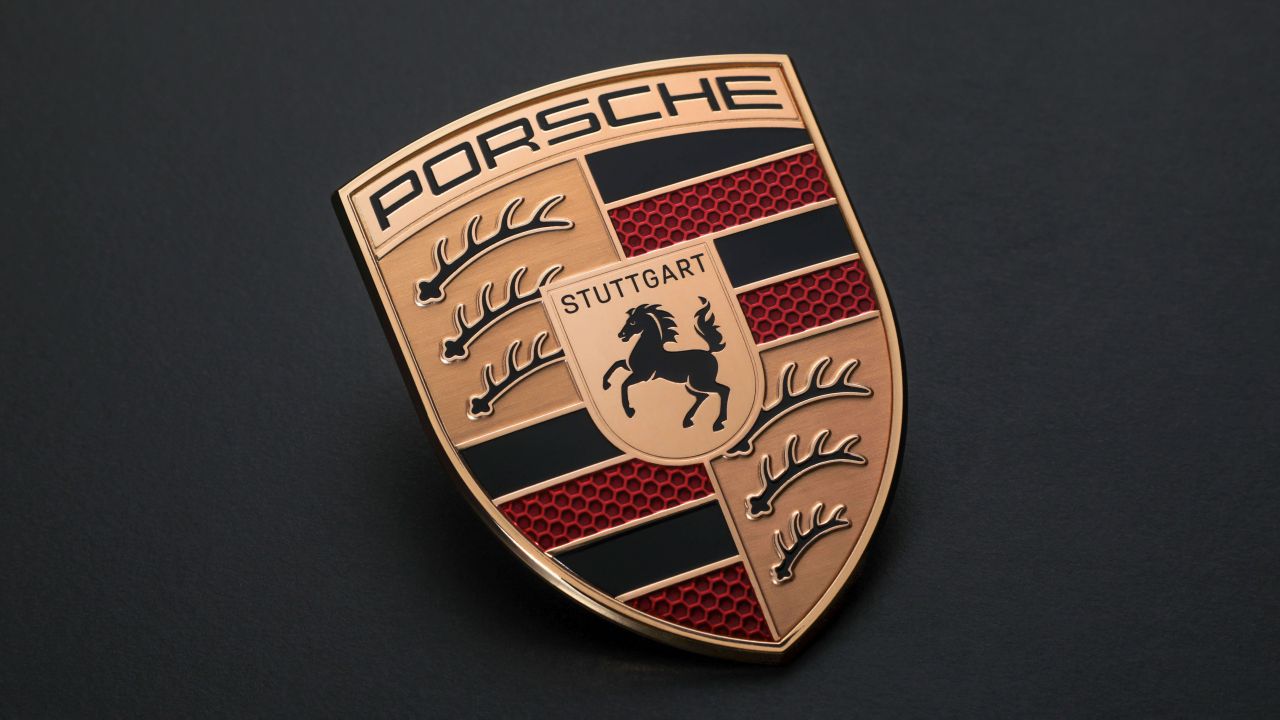

Porsche, in honour of its 75th anniversary, has announced a fresh interpretation of its logo, featuring refined aesthetics and subtle colour adjustments that aim to symbolise the brand's history and future.
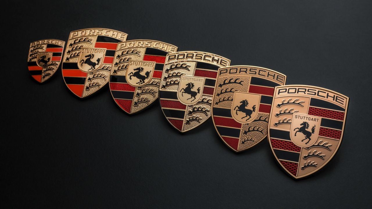
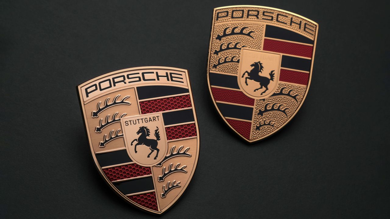
Compared to its predecessor, which made its debut in 2014 as an evolution of the emblem used since 1952, the new logo is said to boast a more substantial silhouette while retaining its distinctive recognition.
Porsche says the new logo required a three-year design process.
Changes include subtle modifications to its colour scheme, with a darker hue now adorning the gold elements, and the lettering adopts a simpler typeface with a thinner font.
The redesign approach extends to the incorporation of the antlers, derived from the coat of arms of the Stuttgart region, which also appear a little more subtler than before. The central figure of the logo meanwhile, originally inspired by Stuttgart's city mascot, the horse, has also been made "more dynamic and more angry".
Most noticeable are the red bands, which now display a honeycomb structure, symbolising the lightweight construction of Porsche's sports cars.
Moreover, the 'Stuttgart' lettering positioned above the horse has been reintroduced in black, adding a touch of “prominence and elegance” to the overall design.
Leading the way as the inaugural vehicle to showcase the new emblem is the upcoming 2023 Porsche Panamera, with dealerships expected to adopt the updated identity simultaneously.